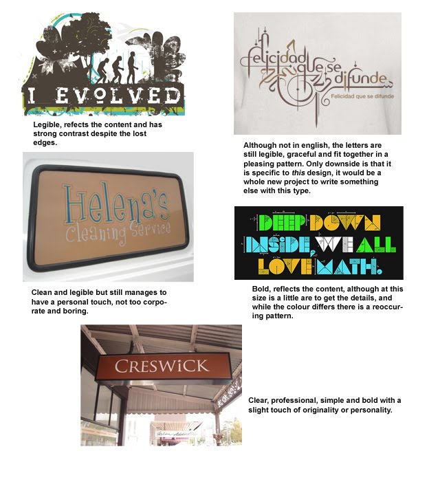
Here are the hero shots for the Digital Assessment 2.
 Here is my Digital Assessment 1, populating a wire frame. I went with this content because I already had the photos and I could speak knowledgeably. I because the majority of the images and the background had a green base, I used a lot of red, which is complimentary, not to mention it fits well with China. The yellow helped with readability.
 Here is the screenshot for the PNG logo activity. I'll admit it isn't the most attractive but I wanted something that would stand out against the clouds. The font was about playing around with kerning. I also had to edit the webpage in Dreamweaver a bit to get the font more centered on the page.
 The first of three webpages that use an image for a background, this is obviously tiled, but it is fairly seamless, it blends well into the background and the image is nicely related to the content.
 Second webpage using an image background, I have always like the stamps used in this page. It is a little obscure in its relationship to the site, but then so is the title, chosen deliberately so, and yet it does illustrate the variety of the site's content. The pale yellows and pastel like colours blend well into the background against the blue.
 Third webpage using a background image, this one is simple, obvious but also understated and relates directly to the content.
 Scanner story image set to blend into a background colour, using a gradient and I think also a layer mask in case a change was needed later.
 Background using Method 4. I used a modified gradient for a smooth transition.
 Background using Method 5. Basically created a simple illustration, using paths, and then duplicated it on another layer and then used the offset filter on the duplicate layer.
 Here is the assessment piece for the design module. The idea was to produce an advertisement for our blogs. I was having some difficulty coming up with an idea, when I stumbled upon an old sketch I had. After playing around with it, particularly with the expression, the idea came to me. Although I am not much of a golfer, the idea is that golf is like Design. If all the elements and aspects are in balance and perfect alignment, it is magic, beauty in motion, and that is what Design is to me. It wasn't until I was about to ink the drawing that I started to think about where the type should go, and one I decided on putting it underneath, I knew that it had to be a newsprint cartoon. After that it was about making the lines appear imperfect, deciding where to put the shading and blacks and finding a texture of newsprint for the background.
 This activity was to explore the possibilities of different image formats for the web. Of the three I went with the jpg at 50 quality because I thought it had the best compression to size ratio, that is this assumes that the image is meant as a high quality close up, in which case it would have been better to go with the PNG 24, which was much more clear, but the file size was a bit high for something like this. As for the design choices on the arrangement, I went with 3rds, which was a little tricky with 10 images in the space but I think the overall them was balance and stability, which is something that going green isn't always associated with, with many people only focusing on the disruptive nature of a change to their normal way of life (see the carbon tax). The type choice I thought was perfect because is sort of represented the quirky culture that is sometime associated with going green, and the background texture brought it all together.
 Version 2. Better focus, better flow.
 For this activity, we had to combine different images using layers and layer masks, with a focus on using gradients in the layer masks. I went with the Wacom tablet as the focus of my image, because I use it all the time. The illustration is one of mine, and I liked playing around with the idea of using a gradient layer mask on the colour layer of the illustration and I think it worked out well. It wasn't actually until the end that I decided to put the flames in as a texture for the background which changed the theme of the image, so I had to change the text, but overall it added some power. The grid was a little tricky and I had to keep subdividing to keep everything sort of lined up, I think I ended up with a 12x8 grid but I cannot be sure. Either way, the nose of the face and the side of the face line up vertically, the sale sign is on an intersection, the tablet lines up and the pen image rests on an intersection. The type which is right alignment, lines up on the borders. Font choice was difficult and I think it could have been a little bolder but colour works with the red of the background and the type itself has a semi formal slightly artistic feel about it. Overall I am pretty happy with the final result.
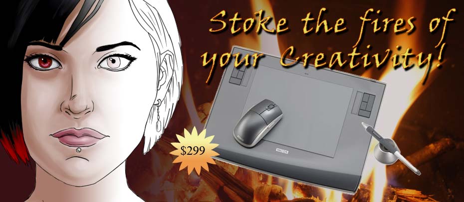 Here is a revised version, which I have changed to improve the elements. The flames now sit behind the tablet, which is not only more appropriate but better graphically because the grey of the tablet isn't dominated by the flames like the illustration was, and by also decreasing the transparency of the flames it is less dominate. Fixed up the type as well, as it was pointed out it didn't so much fit, where I think this one works better. I had to add a drop shadow and some stroke border to make it easier to read, because it was getting a little lost in the flames. Overall, much better.
 Here we had to combine a car with another image and I decide to put it in this one. It was a real challenge because I had to get rid of some elements in front of the car, as well as add in the bottom of the tyre. In order for it to look like it belonged, even if some of it is obscured, I needed to add in some shadows and change the brightness. I adding some colour balancing as well for atmospheric perspective. It still looks like it has been added, but it is about as close as i am going to get it at the moment. Any physical changes, like the tyre, shadows and windows and shopping out the chain in front was painted using layers.
 Here are the high light adjustments. Adjustment layers used for levels and contrast/brightness.
 Here are the low light adjustment photos. Adjusted levels used.
 Here are the magazine pages that seem to conform to grid layouts. I was having a little trouble with understanding the nature of grids a bit. I think I essentially came to the conclusion that a grid was fairly uniform and equally divided for the most part. Which these two do for the most part.
 Here are two magazine pages that don't conform to a grid, as far as I can tell. The reason I felt that they don't use the grid is that there is no uniform division of alignments, even though there are some alignments used.
 This is a website that uses the grid layout as far as I can tell.
 This skyscraper seems to follow a grid as an overall design, and on a much smaller level with all the windows, but i wasn't going to go into that much detail, as it stands, the grid looks a little strange because of the perspective of the photo.

 Here are the layout sketches of a newsletter, business card and website. I wasn't sure if I got it all right, but I was happy enough with the final results.